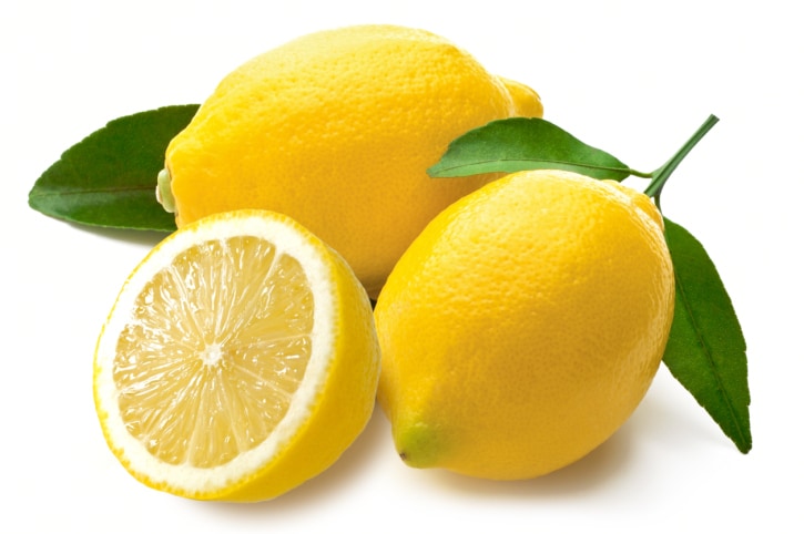
Inspiration:
 |
| This simple photograph was simply used as reference for the shape of the lemons. |
What I have gathered from these inspiration pieces is that simplicity is the key. The real focus should be on the lemon itself, with accompanying things being simple and secondary, as otherwise things could get complicated.
Initial sketches:
Digitised designs:
The initial sketches were uploaded onto Photoshop where they are literally traced round using the paintbrush tool, then uploaded onto illustrator and image traced, to create a cleaner look.
 |
| The design has worked really nicely, however there does seem to be quite a lot of cloud, whereas the emphasis should be on the lemon instead. |
 |
| With two clouds, the pattern looked a bit too cloud heavy, so one of the clouds was removed from the initial sketch, to see if this resolved the problem. |
 |
| One cloud works so much better, and the balance between cloud and lemon is much better proportioned. |
Potential poster:
The concept behind these designs is that the pattern for the bottles can be applied to different outcomes, such as posters, billboards, window vinyl stickers, social media etc. We also want to promote the farmers for Feel Good Drinks, for using natural ingredients and growing them environmentally friendly, and paying the farmers a living wage. However, reading through the project proposal again, it doesn't say anything about the farmers that grow their fruit, which I thought they did, so this could be an inaccurate statement and would have to be changed. They do say a lot about natural ingredients with no added sugar, so perhaps I could just change the tagline...feel good and _____.
Bottle application:
Looking at the pattern applied to the bottle, there is a fair amount of blank space, which makes the pattern look too spread out. This is because of the shape of the bottle, being tall and thin, there isn't enough width to the bottle to allow the pattern full scope. To fix this, the lemons could be moved closer together, to create a denser pattern, but one which isn't too cluttered and cramped. The label was applied at 70% opacity and full opacity, as initially it was thought it would be interesting to be able to see the lemons slightly through the label, however this just adds confusion to the label and makes it too cluttered. At 100% opacity the label just looks very white against the juice itself and the lemon patterns, although perhaps this won't be the case when actually applied to a bottle.


No comments:
Post a Comment