Pattern: Produced by Jade Bristol and Gaby Bracho.
Logo frame: Produced by Jade Bristol and Gaby Bracho.
To show the pattern on the bottles I used an image of the bottle and traced half of it on Illustrator, then used the reflector tool to make sure it was symmetrical. The bottle is made of three parts; first, the part where the pattern and drink will be, second the gap of clear glass or plastic, third the bottle cap. This is because each section needs to have different fills, so it made sense to do it in three parts.
 |
| Left the background pattern is image traced to create a bolder and clearer aesthetic. On the right is the original sketched pattern. This does look more delicate, and the fruits stand out more, however the pattern could look a little grey. |
 |
| With the logo applied. |
 |
| With the logo frame applied, in a rich green tone to represent leaves, giving a clearly natural element. |
 |
| Following on from the feedback I received, I made the fruit larger with less gaps between them so you fit more fruit width wise and the fruit detail was clearer as well. This makes for a much fuller pattern as well. |
 |
| The logo was made larger so that it covered some of the leaves, however this resulted in it looking unbalanced, with too many leaves at the bottom. |
 |
| The leaves were removed from the bottom but kept in their original place and scale at the top, although this looks incredibly odd and top heavy. |
 |
| The logo leaf frame was kept the same as originally used, only smaller so that the logo goes over some of the leaves, on the top and bottom half. I experimented with a white background and pale yellow leaf outline, to see which worked the best. In these designs the fruit is also a little different, as I used the multiply tool on them so that the background colour partially comes through, which makes them feel more like part of the bottle, blending in better. |
 |
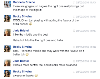
| Following on from feedback the drink flavour was added, in the same green as the logo leaf, however it looks odd being the only real green thing on the label. |
 |
| It was changed to one of the shades of yellow from the leaf frame, which makes it fit in much better. I used the typeface Ebony, which is a bold, slightly heavy but even weighted sans serif, with a bit of fun character and roundedness to it, with an interesting ampersand. This was to emphasise the youthfulness and fun qualities of the brand. |
Minor issue: As the bottle I traced for the outline was the still fruit juice cloudy lemon flavour, for some reason I used those colours for the designs, instead of the actual apple and blueberry flavour colours, which meant an overhaul of colour was needed. Luckily this wasn't much of an issue as it proved really easy to change the colours, which only highlight how simple it is to switch between flavour and colours if needed. This also shows how the design will work for any colour combination dark or light, which means no adaptation will be necessary when switching between flavours.
 |
| Finalised front in correct colours. |
 |
| As the group were pleased with the outcome of this bottle, this design and layout will be applied to the different flavour, and the back for this flavour will be developed. |


No comments:
Post a Comment